



A CSS-only Docusaurus theme built from the same design system that powers Rackscope. Dark-first, opinionated, pixel-perfect.
- Void dark palette: deep neutral blacks (
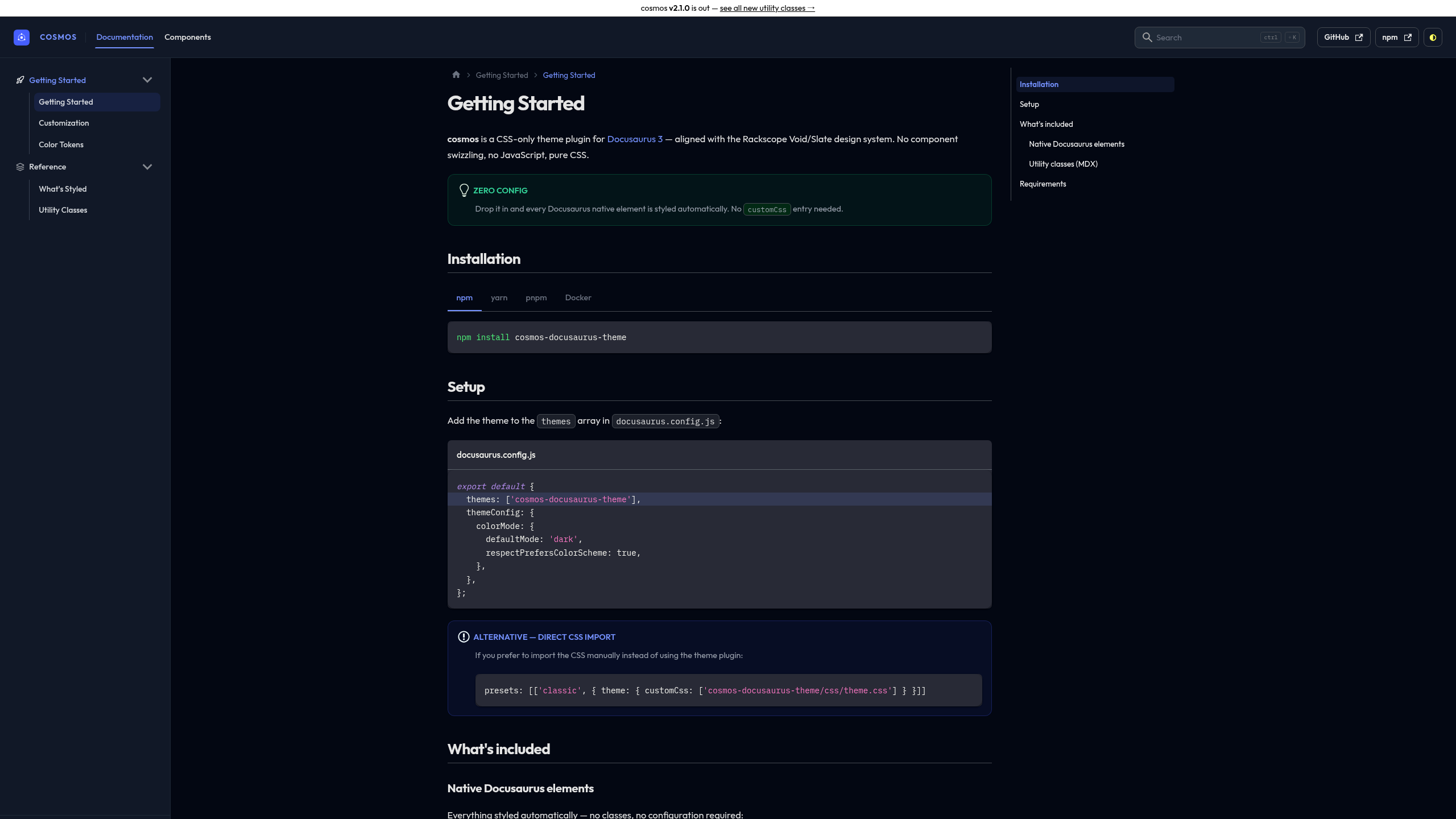
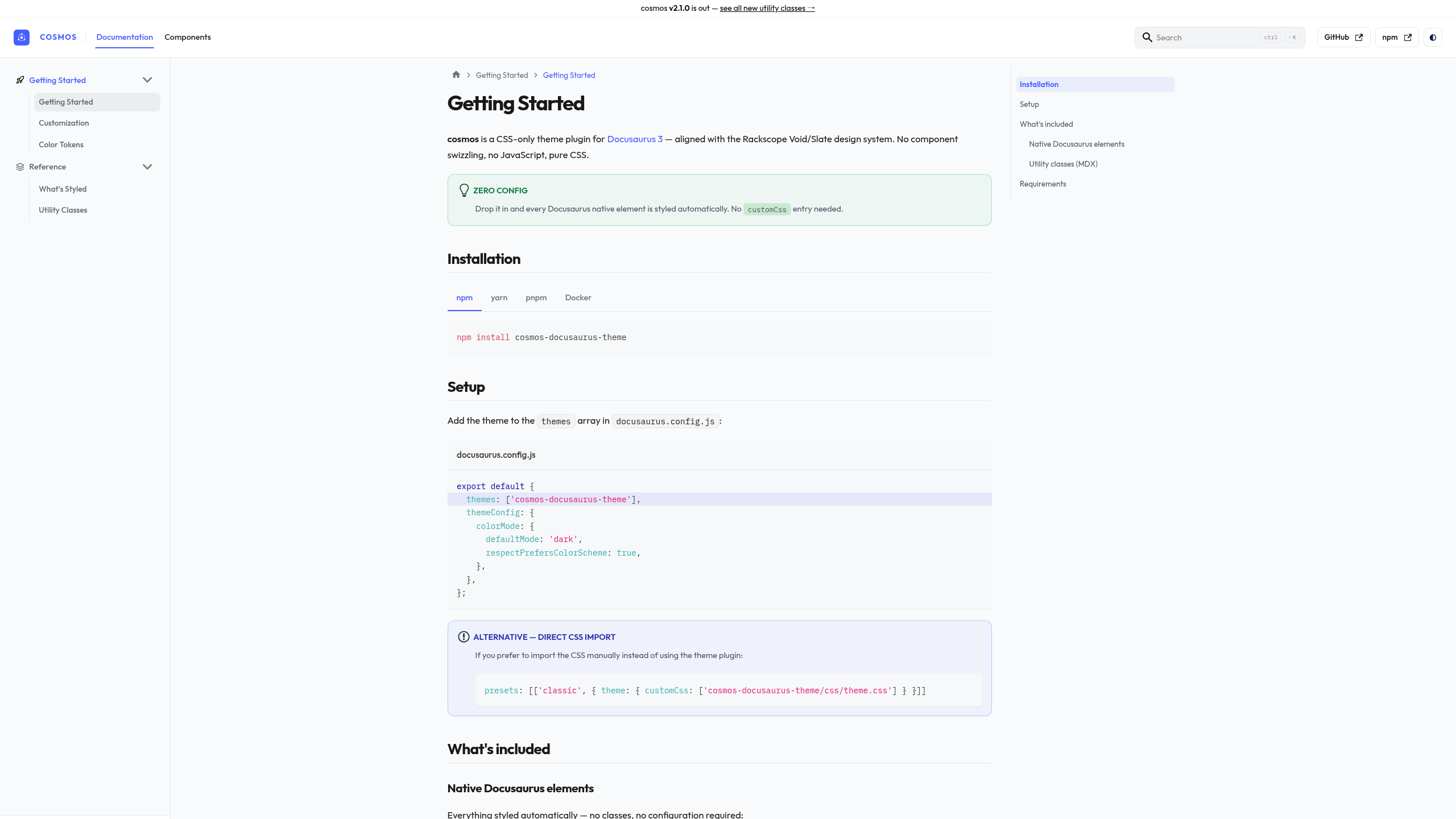
#030712 / #111827) with indigo accents - Slate light palette: gray-50/white surfaces with warm brown text tones, not cold blue-gray
- Outfit display typeface and IBM Plex Mono for code, self-hosted as woff2 (no Google Fonts CDN, so GDPR and CSP friendly)
- Zero JavaScript and no swizzled components: a pure CSS override of Docusaurus Infima
- Every native Docusaurus element styled out of the box
- Utility classes for MDX pages: buttons, badges, steps, timeline, check lists
Built for Docusaurus 3 and verified against the v4 future flags, including Docusaurus Faster (Rspack) and CSS cascade layers.
Dark mode: Void palette
Light mode: Slate palette
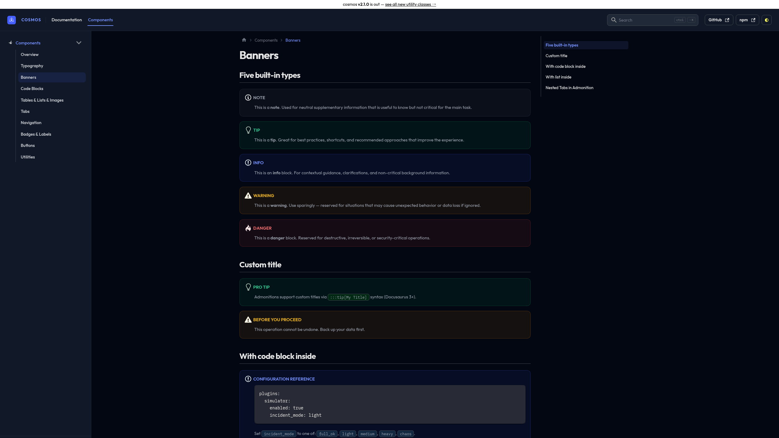
Banners: Dismissible Alert style, semantic icons, full border
See all components live → sckyzo.github.io/cosmos-docusaurus-theme
npm install cosmos-docusaurus-themeexport default {
themes: ['cosmos-docusaurus-theme'],
themeConfig: {
colorMode: {
defaultMode: 'dark',
respectPrefersColorScheme: true,
},
},
};themes: [
['cosmos-docusaurus-theme', {
injectFavicon: false, // disable cosmos favicon injection (default: true)
}],
],git clone https://github.com/SckyzO/cosmos-docusaurus-theme.git
cd cosmos-docusaurus-theme
docker compose up
# → http://localhost:3000Styled automatically, with no configuration needed:
| Element | Notes |
|---|---|
| Navbar: wordmark, ghost buttons, thin vertical separator | Brand indigo title |
| Sidebar: icons, sub-menu line, version badge | className: 'sidebar-cat-*' for icons |
| Breadcrumb: ChevronRight separator, brand hover | Automatic |
| Tabs: flat underline, brand active | import Tabs from '@theme/Tabs' |
| Pagination: monospace sublabel, brand hover | Automatic prev / next |
| Code blocks: all languages, titles | IBM Plex Mono |
| Banners: Dismissible Alert style, semantic icons | 5 types: note / tip / info / warning / danger |
| Tables: full-width desktop, scroll mobile | Automatic |
| Cards: rounded-2xl, dark shadow, hover | <div class="card"> |
| Tags | <span class="tag"> |
| Details / summary: accordion style | <details><summary> |
| TOC: H2/H3 hierarchy + active pill | Right panel |
| Blockquote: brand left border | > markdown syntax |
<kbd>: chip style |
<kbd>Ctrl</kbd> |
| Images: rounded-xl, shadow |  |
<abbr title>: tooltip on hover |
<abbr title="..."> |
| Back-to-top + progress bar | Automatic |
| Algolia DocSearch | --docsearch-* variables |
| Local search (easyops-cn) | --search-local-* variables |
| Announcement bar | themeConfig.announcementBar |
| Smooth dark/light transition | Automatic |
For use in MDX pages (className= in JSX context):
| Class | Purpose |
|---|---|
.btn .btn-primary .btn-secondary .btn-danger |
CTA buttons |
.btn-sm .btn-lg |
Button sizes |
.badge-new .badge-beta .badge-deprecated .badge-experimental |
Release lifecycle labels |
.method-get/post/put/delete/patch |
HTTP method labels |
.status-ok/warn/crit/unknown (aliases: .state-*) |
Operational health labels |
ol.steps |
Numbered procedure guide |
ul.timeline |
Version history / changelog |
ul.list-check |
Feature checklist |
Add className: 'sidebar-cat-*' to any category in sidebars.js:
{
  type: 'category',
  label: 'Getting Started',
  className: 'sidebar-cat-rocket',
  items: ['getting-started'],
}
Available icons: rocket monitor pencil puzzle sliders folder server database layers grid code
Load a custom.css of your own through the classic preset. It applies on top
of the theme:
presets: [
  ['classic', {
    theme: { customCss: require.resolve('./src/css/custom.css') },
  }],
],The brand indigo lives in one place. Override two variables and the whole theme (links, active states, buttons, tints) follows, in both light and dark:
:root {
  --cosmos-brand: #e11d48; /* light-mode accent */
  --cosmos-brand-rgb: 225, 29, 72; /* same color, for translucent fills */
}

[data-theme='dark'] {
  --cosmos-brand-light: #fb7185; /* dark-mode accent (lighter for contrast) */
  --cosmos-brand-light-rgb: 251, 113, 133;
}
You can still override the full Infima palette (--ifm-color-primary,
--ifm-color-primary-dark, …) the usual way if you need finer control.
The theme leans on !important in places to win against Infima and Docusaurus
CSS-module classes. Variable overrides above cascade normally, but if you
override a concrete property (padding, radius, a specific selector) and it does
not take, match the theme's specificity or add !important to your rule.
make install         # install devDependencies
make lint            # CSS + JS + Markdown + format + MDX class= check
make security        # npm audit + no-runtime-deps
make demo-build      # build demo static site
make demo-check      # verify 12 key pages exist in build output
make demo-start      # dev server at http://localhost:3000
make render-test     # assert computed styles in a real browser
make docker-up       # demo in Docker at http://localhost:3000
make render-test runs the render smoke test: it builds the demo, loads it in
Chromium, and checks that the theme's variables, fonts and layout actually
resolve on the page rather than falling back to Infima defaults. For a CSS-only
theme, a build that compiles proves very little, so this is the gate that
matters. See tests/render/.
- Localized sites (i18n). The color-mode toggle's ghost-button border and
hover tooltip are matched on the button's English
aria-label("dark and light mode"). On a site running in another locale, Docusaurus translates that label, so those two touches do not apply. The toggle itself still works and its sun/moon icon coloring (class-based) is unaffected. Everything else in the theme is language-agnostic.
MIT © SckyzO
Bundled fonts (Outfit, IBM Plex Mono) are licensed separately under the SIL Open Font License 1.1.