Shared OWL components + CSS tokens for OCA UI consistency on Odoo 18 and 19.
Single Odoo addon: odoo_design_system. Single canonical Penpot file
at design.hz.ledoweb.com
("Ledo Odoo Design System") is the source of truth.
| Surface | Where |
|---|---|
| Tokens (source of truth) | Penpot TOKENS panel — sets global + theme-light / theme-dark / theme-high-contrast |
| Tokens (committed) | odoo_design_system/static/src/tokens/design-system.dtcg.json |
| Generated SCSS | odoo_design_system/static/src/scss/_tokens.generated.scss (pnpm run tokens) |
| OWL components | odoo_design_system/static/src/components/ |
| Penpot designer guide | docs/penpot/README.md |
| Multi-week buildout plan | docs/penpot/PHASED_BUILDOUT.md |
| DMS case study | docs/case-studies/dms/ + sibling Penpot file |
| Asset Management case study | docs/case-studies/account-asset-management/ |
-
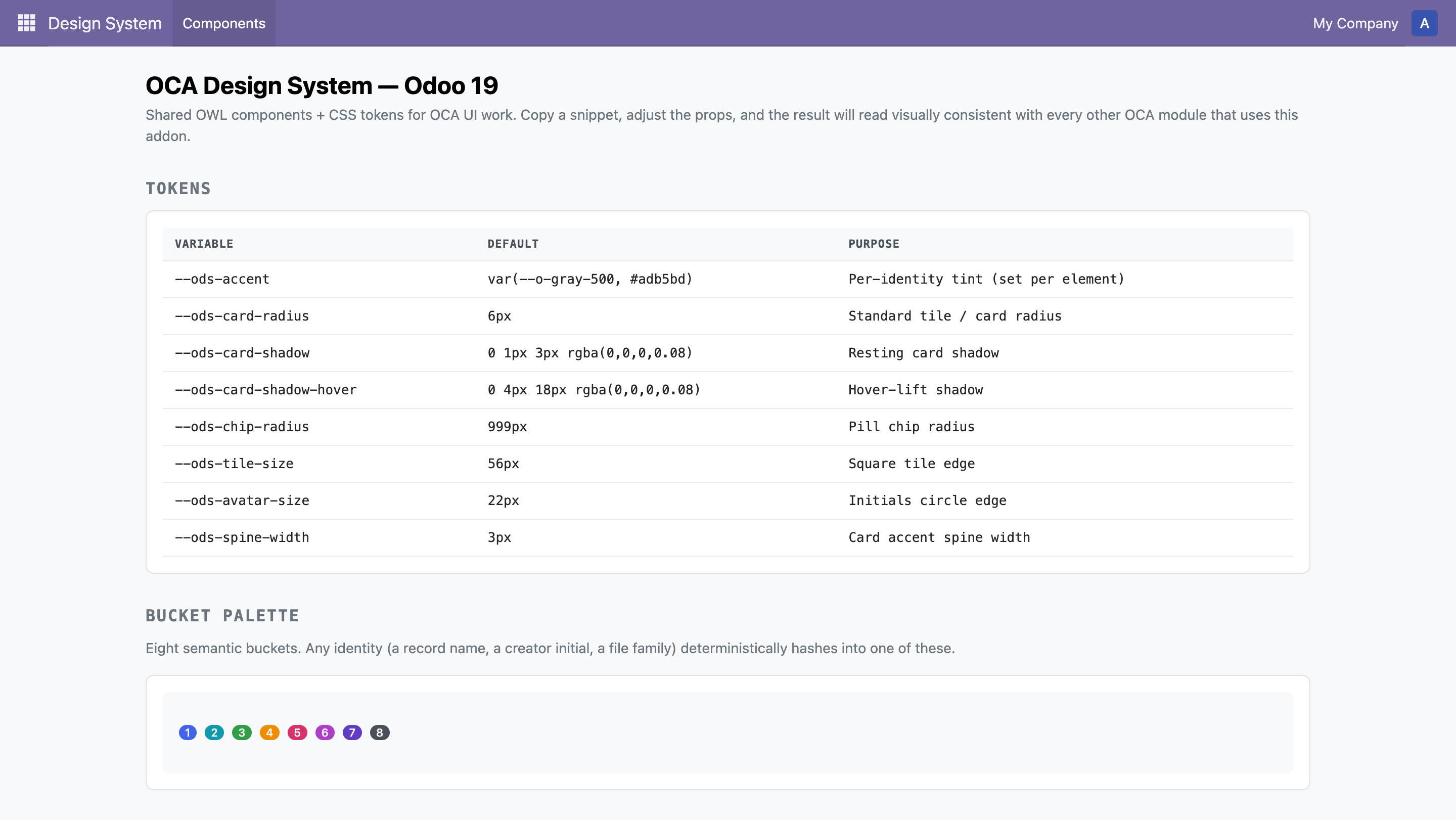
Tokens — DTCG JSON in Tokens-Studio multi-set shape. 181 tokens across four sets:
global(theme-invariant — spacing, typography, radius, motion, brand color, neutral scale, bucket + extension palettes) andtheme-light/theme-dark/theme-high-contrast(color + elevation only). style-dictionary regenerates_tokens.generated.scssdist/brand_variables.scsson demand. Hand-written Sass mixins live in_tokens.scss.
-
Theme machinery — every theme-switchable token (surface, text, border, state, elevation) is emitted under
[data-theme="<name>"]selectors. Toggle in one line:document.documentElement.dataset.theme = "dark"; // or "light", "high-contrast"
-
OWL components
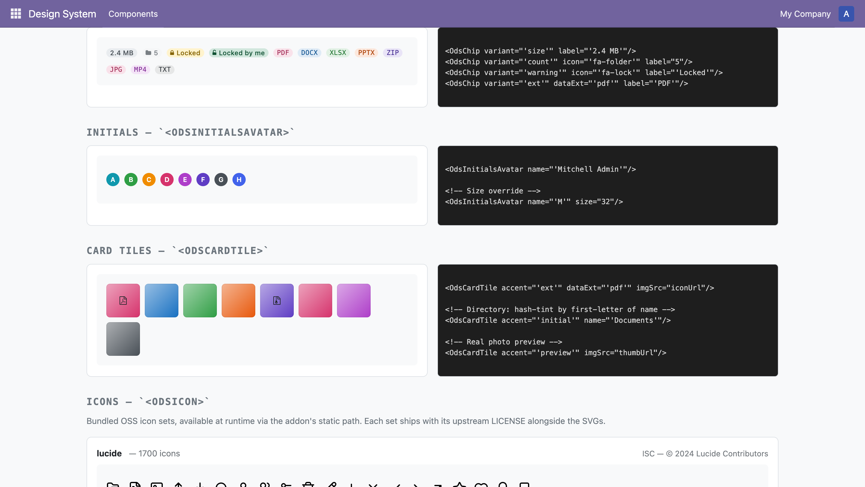
<OdsChip variant="neutral|ext|size|count|warning|success" label="…"/><OdsInitialsAvatar name="…"/><OdsCardTile accent="ext|initial|preview" …/><OdsIcon set="lucide|heroicons|heroicons-solid|heroicons-mini" name="…"/>
-
Showcase — backend menu rendering every component live with the source snippet next to it. Open it via the Design System → Components menu after install. Now includes a 3-button theme switcher at the top — visually verify dark / high-contrast before merging a token change.
-
CI gates —
test.yml—pnpm run tokens:check(regenerates SCSS, fails on drift) +pnpm run test(token + SCSS contract assertions).penpot-token-sync.yml— nightly + on-PR diff between live Penpot and the committed JSON.
- 19.0 — primary release. Manifest version
19.0.3.0.0. Tested on doodba odoo-19 smoke environments. Currently shipping. - 18.0 — backport. Deferred until 19.0 is sealed. The Penpot file
documents both versions (pages
04 — Components / 18.0 deltasand05 — Components / 19.0 deltas) so the design lead is unified even while the addon's installable code ships in one branch first.
OCA UI work tends to re-implement the same micro-patterns (label pills, hashed-tint avatars, accent-coloured kanban tiles) in every module. This addon is the shared substrate so the next OCA module doesn't have to.
Seeded from work in OCA/dms#475 / ledoent/dms#1
— the dms module's _dms_tokens.scss and .o_dms_chip family were
generalized into the --ods-* variables and <OdsChip> component here.
# In your doodba project or directly into addons/
cd custom/src
git clone git@github.com:ledoent/odoo-design-system.git
Then add odoo_design_system to addons.yaml and depend on it from
any module that wants the tokens or components.
Open Design System → Components after install for the live page. Captured from a local doodba odoo-19 smoke test:

The full designer workflow — how to edit a token, propose a new component
variant, and let the round-trip CI close the loop — is documented in
docs/penpot/README.md.
LGPL-3