Responsive Grid is most followed layout system by the designer as it adapts to screen size and orientation, ensuring consistency across layouts.
Responsive Grid is vertical for Vertical Scrollable content. and Horizontal for Horzontal Scrollable content.

The responsive layout grid is made up of three elements: columns, gutters, and margins.
- Columns - Content is placed in the areas of the screen that contain columns.
- Gutters - A gutter is the space between columns that helps separate content.
- Margins - Margins are the space between content and the left and right edges of the screen.
Based on the Device Sizes these values vary to adapte the situation.

Checkout Breakpoint system for element values for all Device types.

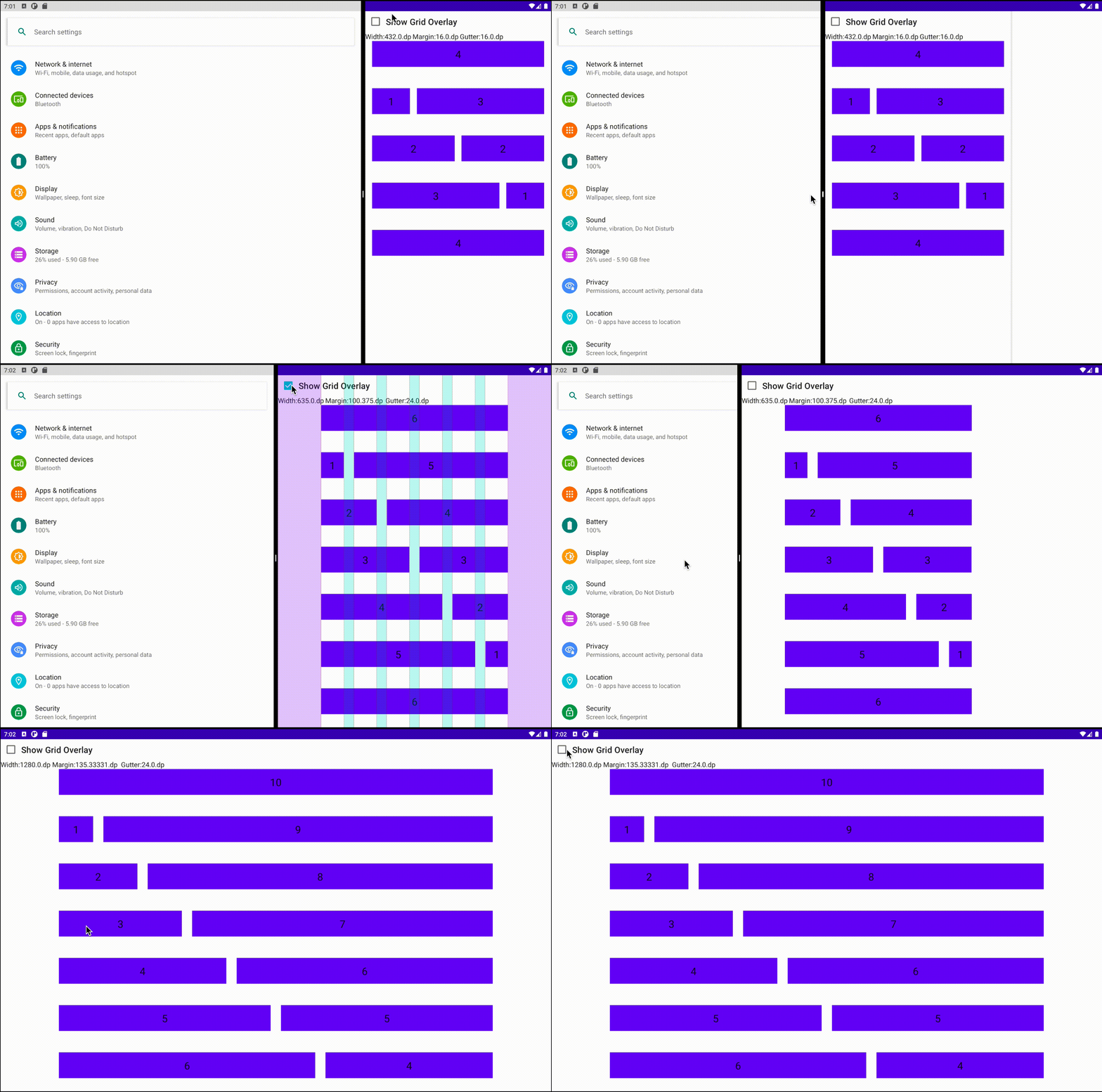
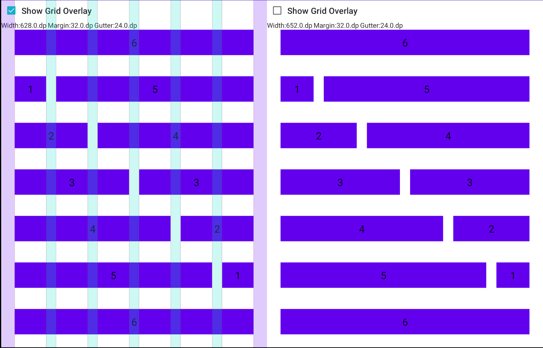
NOTE: Left pane will have less width by gutter width.