A small, dependency-free React component for reliable single-line and multiline text truncation.
It prefers native CSS ellipsis and line clamping, measures the DOM only when a fallback or custom ellipsis is needed, responds to container and font changes, and works naturally in both LTR and RTL layouts.


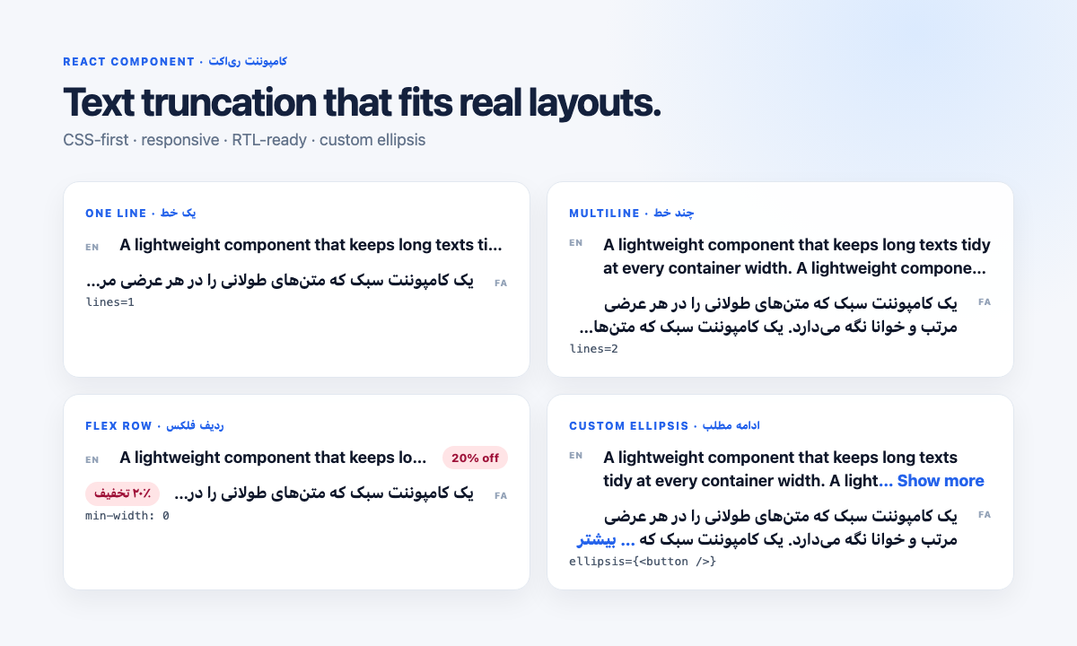
- Small runtime: React is the only peer dependency; no styling framework is required.
- CSS first: native
text-overflowand-webkit-line-clamphandle the common path. - Reliable fallback: DOM measurement and binary search cover custom ellipses and browsers without line clamp.
- Responsive: recalculates after container resizes and web-font loading.
- RTL-friendly: inherits writing direction and supports
dir="rtl"without special configuration. - Unicode-aware: uses
Intl.Segmenterwhen available and never splits UTF-16 surrogate pairs in its fallback. - Library-ready: TypeScript declarations, ESM, CommonJS, SSR-safe effects, forwarded refs, and zero bundled React.
- Battle-tested foundation: extracted from a production UI component that was QA-tested on older iOS Safari and Chrome releases.
npm install react-smart-truncateReact 17, 18, or 19 must already be installed in your application.
import Truncate from 'react-smart-truncate';

export function ProductTitles() {
  return (
    <div>
      <Truncate lines={2} lang="en">
        A long English product title
      </Truncate>
      <Truncate lines={2} dir="rtl" lang="fa">
        یک عنوان طولانی فارسی برای محصول
      </Truncate>
    </div>
  );
}
The component renders a span by default. Give it a constrained width—directly or through layout—so the browser knows where the text must stop.
<div style={{ maxWidth: 280 }}>
  <Truncate>A long product title that should remain on one line</Truncate>
  <Truncate dir="rtl" lang="fa">
    یک عنوان طولانی فارسی که باید در یک خط باقی بماند
  </Truncate>
</div>Every pattern below includes English and Persian so the LTR and RTL behavior is explicit.
<div>
  <Truncate as="p" lines={3} className="description">
    A long English description for a product or merchant.
  </Truncate>

  <Truncate as="p" lines={3} className="description" dir="rtl" lang="fa">
    یک توضیح طولانی فارسی برای محصول یا فروشگاه.
  </Truncate>
</div>.description {
max-width: 32rem;
line-height: 1.5;
}An explicit line-height is recommended when the measurement fallback may run. It also makes the height of each line predictable.
This is the most common source of “ellipsis is not working” reports. Flex items default to min-width: auto, which can prevent them from becoming narrower than their text.
<div>
  <div className="row">
    <div className="textColumn">
      <Truncate className="title">A long English merchant name</Truncate>
    </div>
    <span className="badge">20% off</span>
  </div>

  <div className="row" dir="rtl" lang="fa">
    <div className="textColumn">
      <Truncate className="title">یک نام طولانی برای فروشگاه</Truncate>
    </div>
    <span className="badge">۲۰٪ تخفیف</span>
  </div>
</div>.row {
display: flex;
align-items: center;
gap: 0.75rem;
}
.textColumn,
.title {
flex: 1;
min-width: 0;
}
.badge {
flex-shrink: 0;
white-space: nowrap;
}Use min-width: 0 on every shrinking flex ancestor between the available-width container and Truncate. Keep badges, prices, icons, and actions at flex-shrink: 0 when they must stay visible.
Clamping limits visible lines, but a short title still occupies fewer lines. Reserve the full title area when cards must align:
<div>
  <Truncate lines={2} className="cardTitle" style={{ height: '2.5rem' }}>
    A long English product title
  </Truncate>

  <Truncate
    lines={2}
    className="cardTitle"
    style={{ height: '2.5rem' }}
    dir="rtl"
    lang="fa"
  >
    یک عنوان طولانی فارسی برای محصول
  </Truncate>
</div>.cardTitle {
line-height: 1.25rem;
}The reserved height should equal lines × line-height.
<div>
  <Truncate
    lines={3}
    ellipsis={
      <button type="button" className="more" onClick={openDescription}>
        … Show more
      </button>
    }
  >
    A long English description that needs an inline action.
  </Truncate>

  <Truncate
    lines={3}
    dir="rtl"
    lang="fa"
    ellipsis={
      <button type="button" className="more" onClick={openDescription}>
        … بیشتر
      </button>
    }
  >
    یک توضیح طولانی فارسی که به دکمه ادامه مطلب نیاز دارد.
  </Truncate>
</div>.more {
appearance: none;
padding: 0;
border: 0;
color: #2563eb;
background: none;
font: inherit;
cursor: pointer;
}A custom ellipsis activates DOM measurement so the component reserves the exact space required by your content. Keep the ellipsis inline, and give the text an explicit line height for consistent multiline measurement.
Truncate inherits direction from its parent. You can also set it explicitly through the standard dir attribute:
<section dir="rtl" lang="fa">
  <Truncate lines={2} className="title">
    فروشگاه اینترنتی با یک عنوان طولانی برای نمایش رفتار برش متن
  </Truncate>
</section>

<section dir="ltr" lang="en">
  <Truncate lines={2} className="title">
    An online store with a long title that demonstrates text truncation
  </Truncate>
</section>
Prefer logical CSS properties such as padding-inline-start and margin-inline-end in surrounding layouts. Native ellipsis and line clamp follow the writing direction, and the custom ellipsis is appended in logical text order.
Initially hidden containers
Measurement requires a real width. If the text starts inside display: none, render it when the panel opens or keep the panel in layout with visibility: hidden. Modern browsers will normally remeasure through ResizeObserver; conditional rendering is the most reliable option for older browsers.
| Prop | Type | Default | Description |
|---|---|---|---|
children |
string |
required | Plain text to display and truncate. Markup is intentionally not accepted because the JavaScript fallback operates on a text string. |
lines |
number |
1 |
Maximum visible lines. Only positive integers are accepted; invalid values fall back to one line. |
ellipsis |
ReactNode |
native … |
Custom inline content placed at the truncation point. Providing it enables DOM measurement so its rendered width is reserved. |
as |
'span' | 'p' | 'div' |
'span' |
Semantic HTML element rendered as the outer text container. |
className |
string |
— | Class applied to the outer container. Useful for width, typography, flex behavior, and colors. |
style |
CSSProperties |
— | Inline styles applied last, so consumer values can override component defaults. |
ref |
Ref<HTMLElement> |
— | Forwarded to the outer container for focus, measurement, or integration with other libraries. |
All standard HTML attributes—including id, title, dir, lang, role, data-*, aria-*, and event handlers—are forwarded to the outer element.
- A finite width is required. The width can come from the component, its parent, flexbox, or grid.
- The default one-line and multiline paths use native CSS and do not repeatedly measure text.
- Custom ellipsis content and browsers without multiline clamp use DOM measurement with binary search.
- Text is recalculated when its container resizes and after document fonts finish loading.
- The JavaScript fallback supports plain strings, not nested JSX markup.
- Consumer
stylevalues intentionally override the built-in truncation styles. Avoid overridingoverflow,white-space,text-overflow,display, or-webkit-line-clampunless you want to change the truncation behavior.
The package uses capability detection instead of browser sniffing:
- no
ResizeObserver: falls back to the windowresizeevent; - no
Intl.Segmenter: falls back to Unicode code-point splitting; - no native multiline clamp: falls back to DOM measurement;
- server rendering: renders safely and measures after hydration.
The source component has been QA-tested in production on older iOS Safari and Chrome versions. Exact browser-version guarantees should follow the compatibility matrix of your React application; please include the browser and OS version when reporting a compatibility issue.
Issues and pull requests are welcome. Read CONTRIBUTING.md for setup, test expectations, and guidance for browser-specific reports.
MIT © 2026 Sobhan Yazdanjoo