A reusable TreeView component for Slint, packaged as a Slint library crate so any Slint project can pull it in as a regular Cargo dependency.
Slint does not yet ship a built-in TreeView (slint-ui/slint#505). This crate fills that gap using the canonical flat-list-with-depth pattern (recommended by the Slint team in discussion #1042) and exposes it via the experimental-module-builds feature introduced in Slint 1.14.
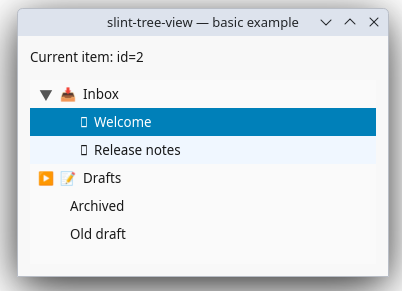
The examples/basic/ app — a tiny interactive tree with branches, leaves, and a section header.
- Hierarchical display via flat-list-with-depth. The host flattens its tree into a
Vec<TreeItem>; the component handles indentation and selection. - Full keyboard navigation: ↑/↓, Home/End, PageUp/PageDown (with
page-size), ← (collapse /current-parent-change-requested), → /+/*(expand / recursive expand),-(collapse), Enter (activate). Unmapped keys bubble viakey-press-event. - Branch indicators with dedicated click target (clicks don't change current item),
z: 1so the indicator TouchArea wins over the row TouchArea when they overlap. - Activation policy —
activation-mode: single-click | double-click.expands-on-double-clicktoggles whether double-clicking a branch expands it or activates it. - Full theming via the
TreeViewStyleglobal: 9 colors (highlight + highlighted-text in both focused and inactive variants, hover, branch-indicator, branch-line, disabled-text, drop-indicator), 5 dimensions, 2 glyphs. - Non-selectable / disabled items.
selectable: falsefor section headers (skipped by mouse);enabled: falsefor greyed-out items, applied via bothdisabled-text-colorand a multiplicativedisabled-opacityso it's visually obvious. - Accessibility hooks — every item exposes
accessible-role: list-item+accessible-label. - Right-click → context menu via
pointer-event(filters for right-button-down; Slint 1.17 has no dedicatedright-clicked). - Rust DX —
TreeItem::branch()/::leaf()/::section()constructors; fluent builder methods (.with_icon(),.with_decoration(),.collapsed(),.disabled(),.non_selectable(),.with_item_type(),.with_user_data());NO_PARENTsentinel;index_of_id()/index_of_id_model()lookup helpers; constructors takeimpl Into<slint::SharedString>so&str/String/SharedStringall work without extra allocations. #![deny(unsafe_code)]at the crate root (Slint's generated vtable module locally allowsunsafefor its plumbing).
# Cargo.toml
[dependencies]
slint = "1.17"
slint-tree-view = "…"

[build-dependencies]
slint-build = { version = "1.17", features = ["experimental-module-builds"] }// build.rs
fn main() -> Result<(), Box<dyn std::error::Error>> {
slint_build::compile("ui/main.slint")?;
Ok(())
}// ui/main.slint
import { TreeView, TreeItem } from "@TreeView";
export component App inherits Window {
forward-focus: tree;
tree := TreeView {
model: [ /* TreeItem[] */ ];
current-changed(id) => { /* update your editor pane */ }
item-activated(id) => { /* open / paste / etc. */ }
item-expand-requested(id) => { /* flip expanded=true in your model */ }
item-collapse-requested(id) => { /* flip expanded=false */ }
}
}use slint_tree_view::{TreeItem, NO_PARENT};
fn build_model() -> Vec<TreeItem> {
vec![
TreeItem::branch(1, NO_PARENT, 0, "Inbox").with_icon("📥"),
TreeItem::leaf(2, 1, 1, "Welcome", "Hello world").with_icon("✉️"),
TreeItem::section(100, NO_PARENT, 0, "Archived"),
TreeItem::branch(3, NO_PARENT, 0, "2024")
.with_icon("📦")
.collapsed(),
]
}There's also a fully-runnable example at examples/basic/ — see Examples below.
export struct TreeItem {
    internal-id: int,         // stable id; passed back in every callback
    parent-internal-id: int,  // NO_PARENT (-1) = root; cached for jump-to-parent
    depth: int,               // 0 = top level; each unit adds `indentation`
    text: string,             // user-visible label
    decoration-text: string,  // host-chosen glyph; empty = nothing drawn
    item-type: int,           // app-defined discriminator; not interpreted
    user-data: string,        // opaque payload; never read by the component
    has-children: bool,       // structural hint; drives the branch indicator
    expanded: bool,           // current expand state; drives ▼ vs ▶
    selectable: bool,         // false = section header / non-clickable
    enabled: bool,            // false = greyed out, ignored by mouse & keyboard
}| Constructor | Description |
|---|---|
TreeItem::branch(id, parent_id, depth, text) |
Has children, expanded by default, selectable+enabled. |
TreeItem::leaf(id, parent_id, depth, text, user_data) |
No children, not expanded, selectable+enabled. |
TreeItem::section(id, parent_id, depth, text) |
Non-selectable (section header). Still visible. |
| Builder | Effect |
|---|---|
.with_icon(glyph) / .with_decoration(glyph) |
Set decoration-text. |
.collapsed() / .with_expanded(bool) |
Override the default expand state. |
.disabled() |
Set enabled = false. |
.non_selectable() |
Set selectable = false. |
.with_item_type(int) |
Set item-type. |
.with_user_data(string) |
Set user-data. |
All text arguments are impl Into<slint::SharedString>, so &str, String, and slint::SharedString all work without extra allocations.
pub const NO_PARENT: i32 = -1;

pub fn index_of_id(items: &[TreeItem], internal_id: i32) -> Option<usize>;
pub fn index_of_id_model(model: &slint::ModelRc<TreeItem>, internal_id: i32) -> Option<usize>;
NO_PARENT is the sentinel for top-level items' parent-internal-id. The two index_of_id flavors are the lookup hosts need constantly when handling TreeView callbacks (which report ids) against their own model.
| Property | Type | Default | Description |
|---|---|---|---|
model |
[TreeItem] |
[] |
The flattened tree data (in — the view never mutates it). |
current-index |
int |
-1 |
Index of the current item, or -1. |
current-internal-id |
int |
(read-only) | Id mirror of current-index. Hosts should prefer correlating on this. |
focused |
bool |
true |
When true, uses highlight-color; otherwise inactive-highlight-color. |
items-expandable |
bool |
true |
Whether the user can expand/collapse interactively. |
root-is-decorated |
bool |
true |
Draw branch indicators at the root level. |
expands-on-double-click |
bool |
true |
Whether dblclick on a branch toggles it (vs. activates it). |
activation-mode |
ActivationMode |
double-click |
Mouse activation policy (single-click / double-click). |
hover-highlight |
bool |
true |
Highlight the item under the cursor. |
page-size |
int |
-1 |
PageUp/PageDown step; -1 ⇒ heuristic 10. |
| Callback | Signature | When |
|---|---|---|
current-changed |
(int id) |
Current item changed (click or keyboard). |
item-clicked |
(int id) |
Row clicked. |
item-double-clicked |
(int id) |
Row double-clicked. |
item-activated |
(int id) |
Row activated (per activation-mode, or Enter, or dblclick on a leaf). |
item-expand-requested |
(int id) |
Request to expand a branch. |
item-collapse-requested |
(int id) |
Request to collapse a branch. |
recursive-expand-requested |
(int id, bool expand, int depth) |
Recursive expand/collapse (depth == -1 = unlimited). |
current-parent-change-requested |
(int id, int parent-id) |
Left-arrow on a collapsed branch / leaf: host should move current up. |
custom-context-menu-requested |
(int id, length x, length y) |
Right-click. |
key-press-event |
(KeyEvent) -> EventResult |
Any unmapped key. Return accept to handle, reject to bubble. |
| Key | Action |
|---|---|
| ↑ / ↓ | Move current by 1 (clamped; no wrap). |
| PageUp / PageDown | Move current by page-size (or 10). |
| Home / End | First / last item. |
| ← | Collapse a branch if expanded, else emit current-parent-change-requested to move up. |
→ / + |
Expand a collapsed branch. |
* |
Recursive expand (recursive-expand-requested). |
- |
Collapse the branch unconditionally. |
| Enter | Activate the item (gated on enabled). |
| other | Forwarded to key-press-event. |
Override globally from Slint:
import { TreeViewStyle } from "@TreeView";

TreeViewStyle {
    highlight-color: @palette.primary;
    row-height: 24px;
    indentation: 16px;
}
…or from Rust after the window exists:
use slint::Global;
use slint_tree_view::TreeViewStyle;

let style = TreeViewStyle::get(&main_window);
style.set_highlight_color(slint::Color::from_rgb_u8(0x1e, 0x90, 0xff));
style.set_row_height(22.0);| Category | Property | Default |
|---|---|---|
| Colors | background-color |
Palette.background |
text-color |
Palette.foreground |
|
disabled-text-color |
Palette.alternate-foreground |
|
highlight-color / highlighted-text-color |
Palette.selection-background / Palette.selection-foreground |
|
inactive-highlight-color / inactive-highlighted-text-color |
#e8e8e8 / black |
|
hover-color |
#f0f7ff |
|
branch-indicator-color |
#555 |
|
branch-line-color |
transparent (sets the indent strip's bg; real L/T guide lines are roadmap) |
|
drop-indicator-color |
#2266aa (reserved for future DnD) |
|
| Dimensions | row-height |
28px |
indentation |
20px |
|
branch-indicator-width |
16px |
|
decoration-spacing |
6px |
|
horizontal-padding |
StyleMetrics.layout-padding |
|
| Opacity | disabled-opacity |
0.6 (multiplied onto disabled rows on top of the greyed text color) |
| Glyphs | expanded-branch-indicator |
▼ |
collapsed-branch-indicator |
▶ |
Behavior flags (items-expandable, root-is-decorated, expands-on-double-click, activation-mode, hover-highlight, page-size) are per-instance properties on TreeView, not on the global — they can differ between TreeViews in the same app. The global only carries theme colors / dimensions / glyphs.
Palette awareness (v0.2.0+): six semantic defaults above (background-color, text-color, disabled-text-color, highlight-color / highlighted-text-color, horizontal-padding) are sourced from Slint's Palette and StyleMetrics globals. The widget therefore follows the host application's theme automatically — including light/dark mode via Palette.color-scheme — with zero host wiring. Setting any of these properties on a TreeView instance still overrides the theme, exactly as before.
examples/basic/ is a minimal standalone crate (it carries its own Cargo.lock and is intentionally not part of the root workspace) that pulls in slint-tree-view and wires up a tiny interactive tree. It demonstrates the four things every consumer has to do:
Run it from inside the example directory:
cd examples/basic
cargo run(cargo run -p tree-view-basic-example from the repo root does not work — the example is workspace-excluded by design, so the root has no package by that name to dispatch to. Use cd or, as a one-liner from the root, cargo run --manifest-path examples/basic/Cargo.toml.)
A few behaviors are impossible to implement inside the .slint file because the Slint language is declarative and intentionally limited. The workarounds all push the work to the host via callbacks:
- No
whileloops, no mutable locals. Slintletbindings are immutable; there is novarorwhile. This means the "skip past non-selectable items" walk cannot be expressed.step-current(the Up/Down handler) moves by exactly 1; the host'scurrent-changedhandler sees whatever landed and can adjust. - No array search. "Find the item whose
internal-id == X" needs a loop. Socurrent-parent-change-requestedis delegated to the host: the row cachesparent-internal-id, and the component emits it directly. The host (which has its own index structure) finds the parent's index and updatescurrent-index. Same story for finding an item by id from Rust — use the providedindex_of_id/index_of_id_modelhelpers. - No viewport-size introspection. Slint's
ListViewdoesn't expose the visible-row count from outside, so PageUp/PageDown usepage-size(default heuristic 10).
Likely additions as the need arises (contributions welcome):
accessible-expanded/accessible-disabledbindings as soon as Slint supports them onAccessibleRole::list-item(currently a 1.17 gap).- Multi-selection.
selected-internal-ids: [int]alongsidecurrent-index, plus aselection-modeflag (single / multi / extended). Shift+Click and Ctrl+Click would arrive via the existingkey-press-eventcallback (Slint reports modifier state on the KeyEvent). - Multi-column support. Single-column for v1; adding a
columns: [TreeColumn]property (header label + per-item cell) is the natural extension. - Drag & drop reorder. Per-item
Rectanglealready has the structure to host aDropArea; what's missing is the protocol for the host to express "this item accepts drops onto / between".auto-expand-delay-mswould fold in once DnD exists. - Inline editing (F2). When
editing-idis set, swap the item'sTextfor aLineEditand emitedit-committed(id, new-text)on focus loss / Enter. - Real branch guide lines.
branch-line-colorcurrently colors the whole indent strip; drawing proper L/T guide lines needs aPathoverlay. - Animations.
animatedflag for expand/collapse transitions. - Right-to-left layout. Currently hardcoded LTR.
- Lazy loading / on-demand item materialization. Slint's
ListViewdoesn't expose a "give me items N..M" hook, so true lazy loading isn't possible without changing the model contract. For 10k+ item trees, the host should filter at the source. - Custom cell renderers / delegates. If you need rich per-item UI (buttons, progress bars), wrap
TreeViewin your own component that overlays them.
- The Slint team for the toolkit and the
experimental-module-buildsfeature. - KDAB's article on building reusable Slint UI libraries — the inspiration for packaging this as a crate.